Agency years. One client each, two products that still hold up.
Clients
Tigerspike + Isobar/Dentsu
Role
Lead UX & Experience Designer
Timeline
2016 - 2017
Outcomes
7x usage + 45% retention lift
TL;DR
Ten years ago, one client per agency, real outcomes I can still point at. Priority Pass got 7x more usage after the rebuild. Enterprise’s EPlus loyalty programme lifted retention for frequent renters by 45% and is still live a decade on.
Old work, but the thinking holds up.
Priority Pass at Tigerspike
7xMore usage than the app it replaced
6Months to V1
Business problem
Adoption was the headline metric. The new app had to earn it against the version it replaced.
User problem
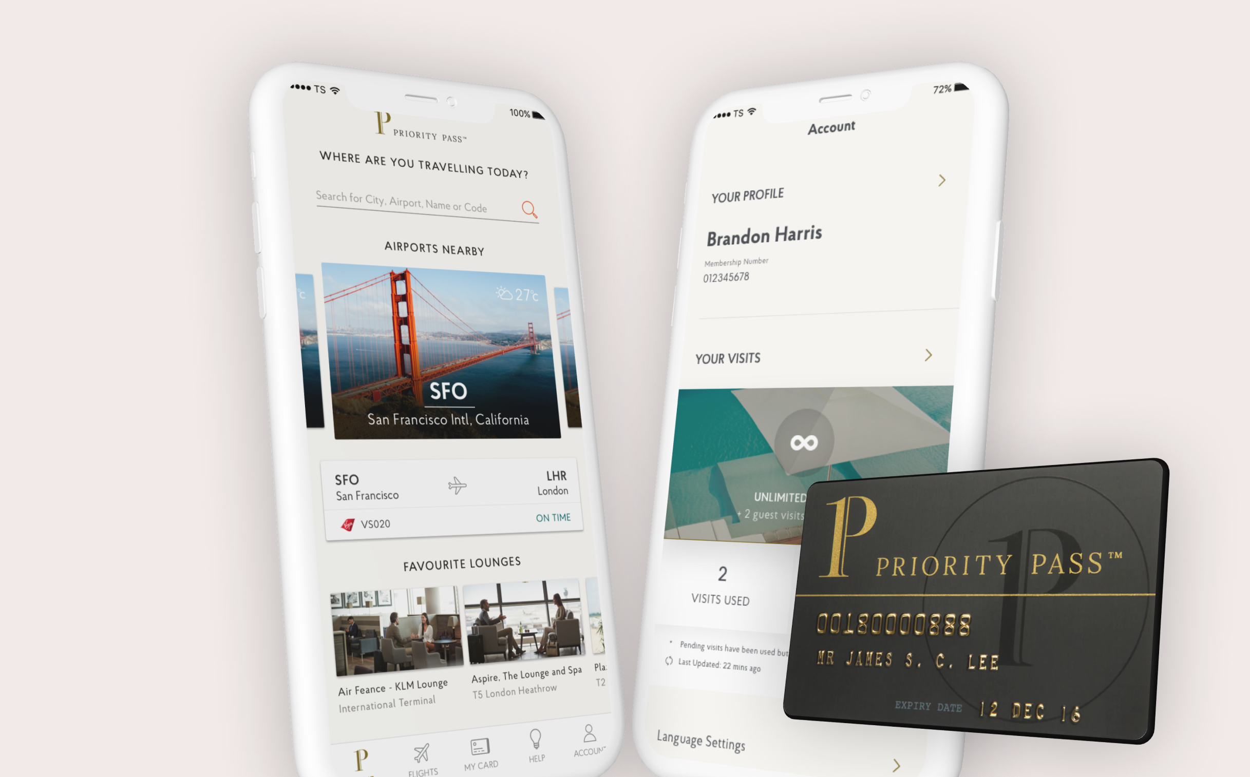
At the lounge door, the one moment that matters, nobody wants to hunt for their card.
The research
It was a status thing
Lead UX designer on the new app. We started with research: competitor teardown, plus airport research on actual lounges with both Priority Pass users and competitors’ users.
The most useful finding was not about features. Having a Priority Pass was a status thing. People were proud of it; the card was a signal that you had done well.
So we made sure the app gave that pride its moment.
The call
Get you through the door fast
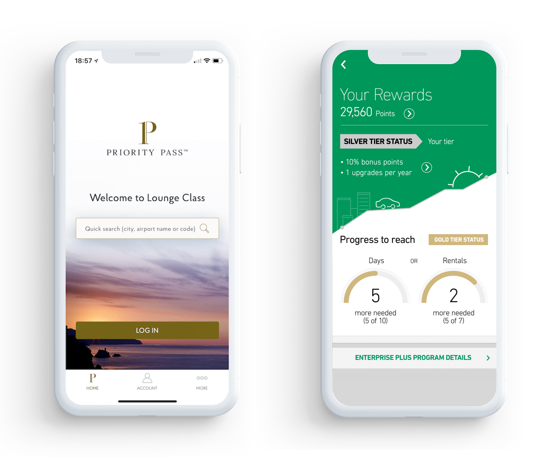
But the real job was getting you into the lounge fast. I pushed for a UX that was direct: clear about how to access a lounge, and quick to pull up your digital card to get you through the door.
No hunting, no friction at the one moment friction actually hurts.
Where it landed
7x the usage
We shipped V1 in six months, then spent the next two sprints optimising against real usage data.
Adoption was their headline metric. The new app got 7x more usage than the version it replaced.
Enterprise Rent-A-Car at Isobar/Dentsu
45%Frequent-renter retention lift, EPlus
+22%Conversion on closed-branch journeys
Business problem
Frequent customers had never had a loyalty layer of their own.
User problem
If the branch was closed, the experience just stopped. No alternatives, no next step.
The role
Three pieces of work
Lead experience designer, UX and UI, with the US team running customer validation.
01EPlus loyalty programmeA new product, designed end to end
02The websiteKey web journeys
03The closed-branch fixA dead end turned into a next step
EPlus
A layer frequent renters never had
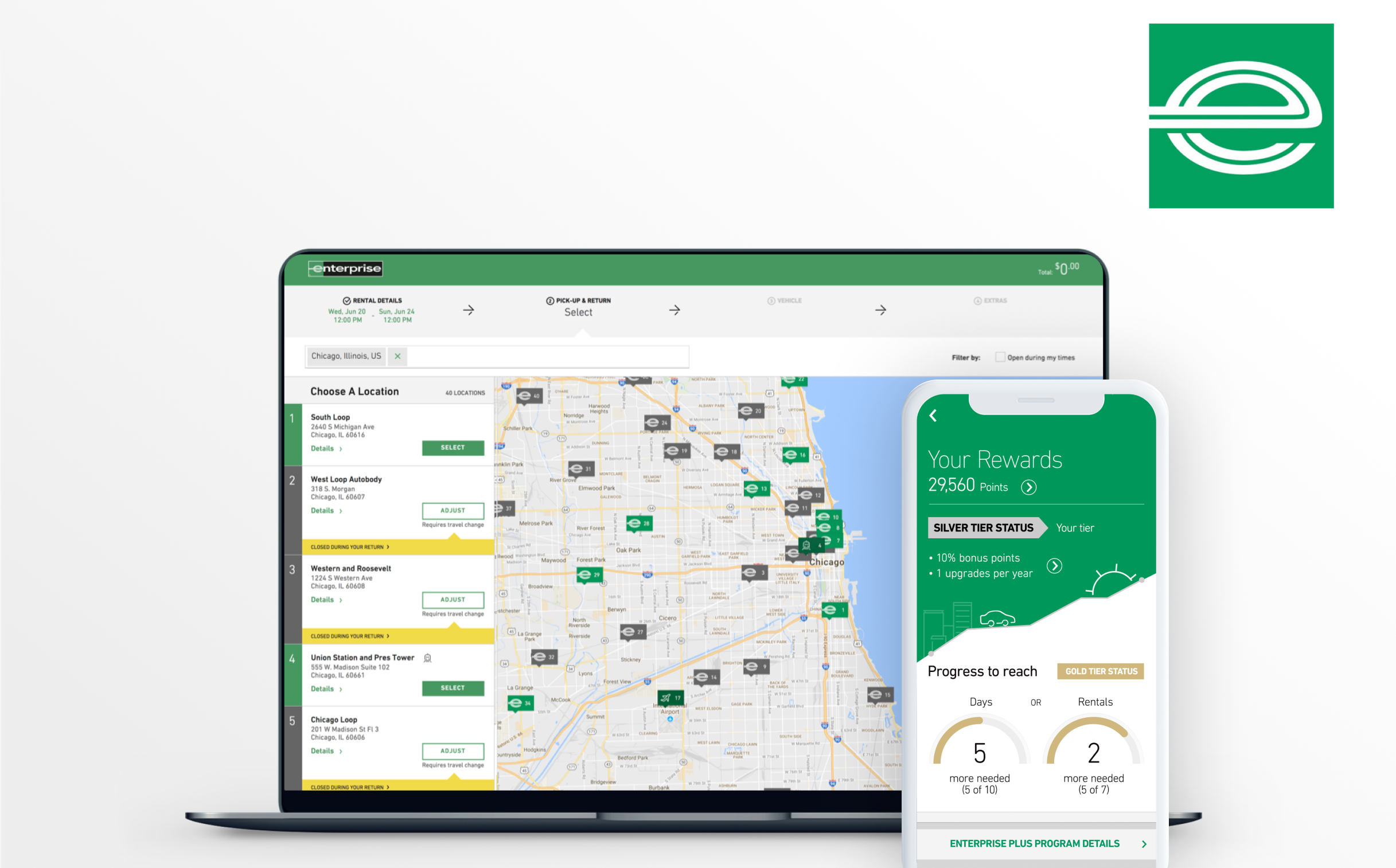
EPlus was a new product, a layer frequent customers had never had. I designed the experience and interface end to end; the US team validated with customers.
It tested exceptionally well and lifted retention among frequent renters by 45%. It is still live today, ten years later.
The closed branch
No more dead ends
If someone arrived to pick up or return a car and the branch was closed, the experience just stopped. No alternatives, no next step.
We rerouted people to the nearest open branch and gave them a clear path forward.